The rules for using the Sorting Labels ensure consistent and correct usage. The rules facilitate good readability and recognition across various applications, such as packaging, recycling stations, return points, waste containers, and public spaces.
The colors of the Sorting Labels make it easier to recognize the different labels, and black text on a white background ensures optimal readability and supports universal design.
Each user of the Sorting Labels is responsible for following the rules. Clear rules help ensure correct labeling, preventing confusion and improper sorting.
The use of the Sorting Labels is continuously expanding to more areas. If you have any suggestions or questions, please contact us at LOOP ([email protected]).
Colors of the Sorting Labels
Color Usage
Each waste category has its own defined color, and all the Sorting Labels within the same category share the same color.
- The Sorting Labels should always be used in their primary color.
- It is not permitted to modify the colors of the Sorting Labels.
Correct use of colors (examples):

Incorrect use of colors (examples):

Exception for Packaging:
- If, for specific reasons, it is not possible to use the Sorting Labels in color on packaging, they may be used in black and white. Specific reasons may include printing limitations and budget constraints. In such exceptional cases, it is also allowed to use the label in various shades of gray/black on packaging.
- It is recommended to avoid using the Sorting Labels in black and white, as this is the label color for residual waste.
Correct use of colors on packaging:

Printing on Colored Backgrounds (Outline)
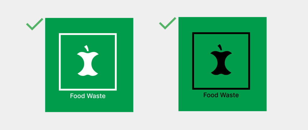
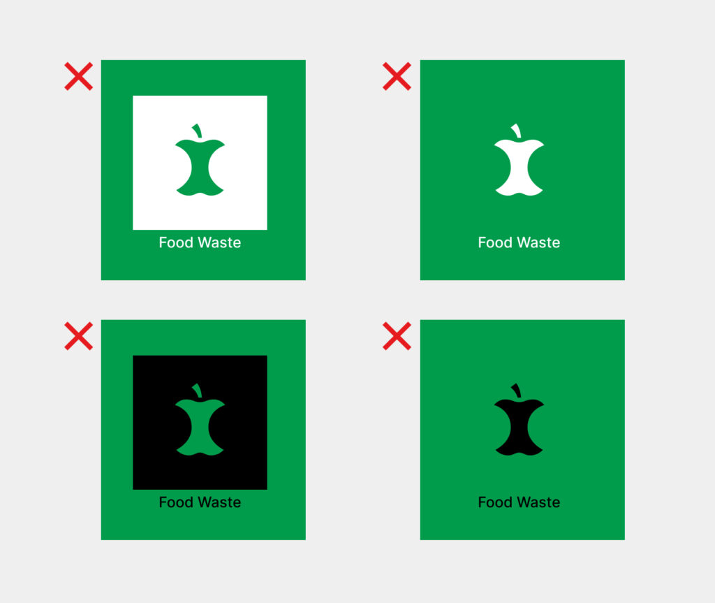
The Sorting Label can be used with a black or white outline when the colored background matches the label color. This applies, for example, to waste bags and lids on waste containers.
Correct use of single-color print outline:
Incorrect use of single-color print outline (examples):
Printing on Transparent Backgrounds
In general, three-color printing is recommended on transparent backgrounds, such as transparent waste bags. If, for specific reasons, this is not possible, the Sorting Label may be used in one or two print colors. Specific reasons may include printing limitations or printing costs.
Correct printing on transparent and white surfaces:

Incorrect printing on transparent and white surfaces:

Color Codes
See color codes for all the Sorting Labels
Usage:
• Pantone – Print
• CMYK – Print
• RGB – Web
• RAL – Foil/Signage
Shape and Size of the Sorting Labels
Shape
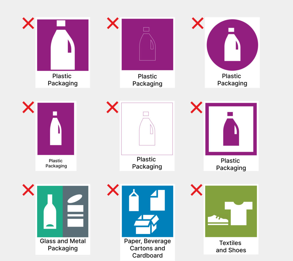
The shape of the Sorting Labels must be square, and the colored area within the Sorting Labels must also be square.
- It is not permitted to alter the shape.
- It is not permitted to include multiple icons within the same label.
Correct use of shape:

Incorrect use of shape (examples):
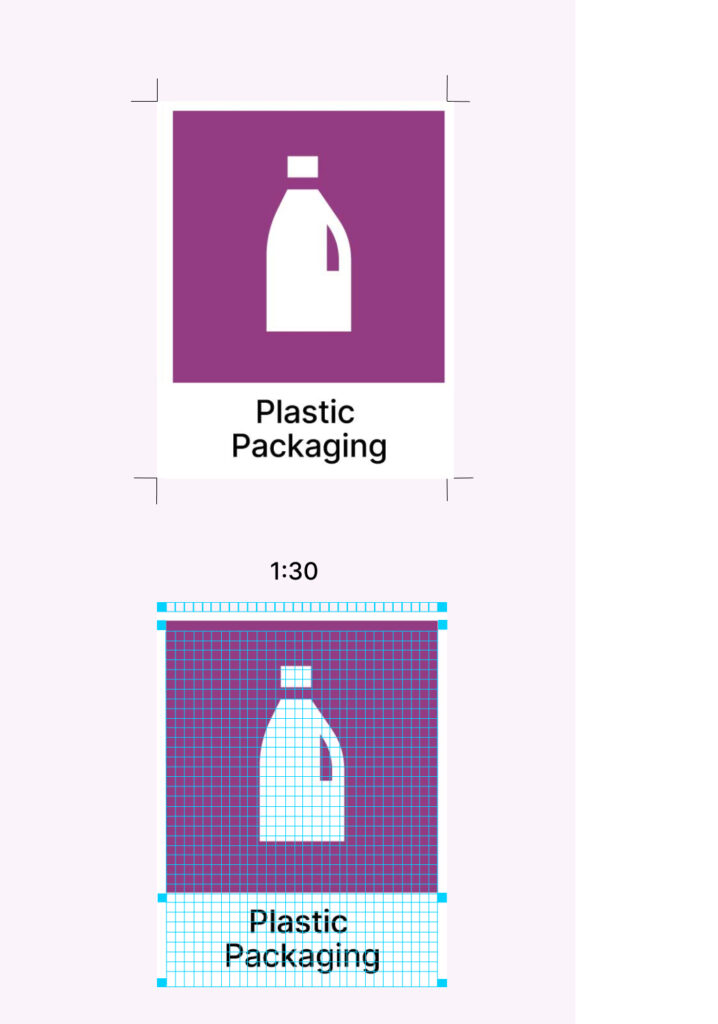
White Border
The Sorting Labels should have a white border to highlight the category color. The white border helps increase the visibility of the Sorting Labels on the surface it is placed on.
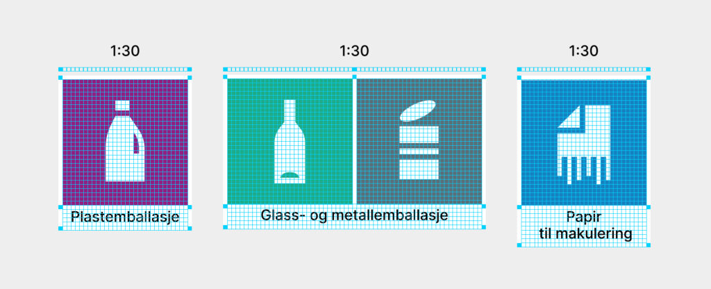
- The defined size ratio for the white border is 1:30, ensuring that the thickness remains proportional when scaling.
- For combination labels, the spacing between the labels should match the thickness of the white border.
Correct use of white border:
Exception for packaging:
- On packaging, a white border around the Sorting Labels is not required, but spacing should be used when multiple labels are applied.
Correct use of spacing on packaging with multiple Sorting Labels:

Size of the Sorting Labels
The size of the Sorting Labels depends on the surface on which they are used. The requirement is that the Sorting Labels must be clearly visible and easy to read.
[sortere-general-file-link-list]Size for use on packaging:
For packaging, it is recommended to use the Sorting Labels with a minimum size of 10×10 mm. For packaging with limited space, the Sorting Labels can be used in 6×6 mm. Place the Sorting Labels where they are easy to see (also refer to recommendations for text placement).
Recommended minimum size for packaging:


Text on the Sorting Labels
Typography
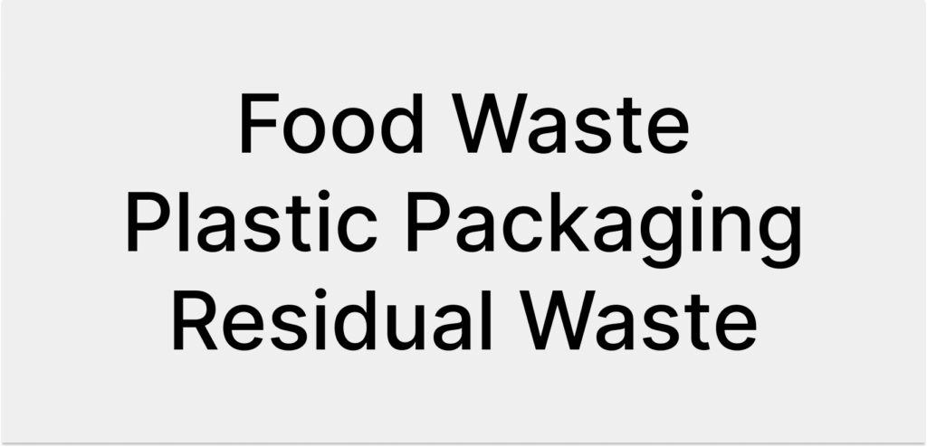
The font used is called Inter and is available for free download. It has good readability and is license-free.
- Inter Medium is used for the name of the waste type.
- The name of the waste type is written with a capital letter at the beginning of each word.
Placement of the Waste Type Name
- Vertical format: The waste type name is centered below the colored area.
- Horizontal format: The waste type name is left-aligned to the right of the colored area.
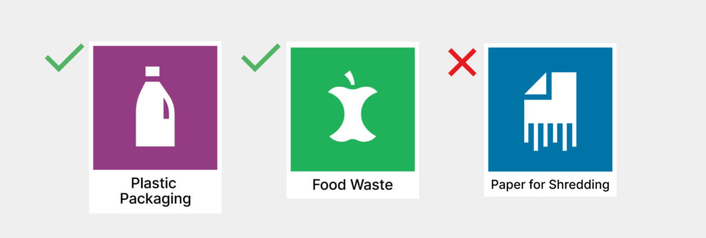
- The waste type name must always be placed outside the colored area, with black text on a white background.

Incorrect placement of text (examples):

Text Size
The text size must be the same across all the Sorting Labels. This also applies to combination labels and when the text spans two lines.

Incorrect text size (examples):
Text on Packaging
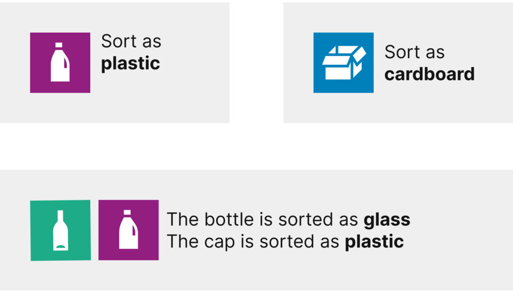
On packaging, the waste type name is not used under the Sorting Label.
- The Sorting Label is accompanied by explanatory text that explains how the packaging should be sorted after use. The waste type name(s) should be highlighted.
- The Inter font is recommended, but it is also permitted to use the same font as the rest of the packaging.
Examples of the Sorting Labels and explanatory text on packaging:
Multiple Languages
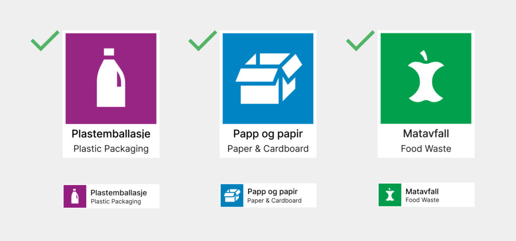
Names of the waste types are available in several languages, including the two Norwegian written forms, Bokmål and Nynorsk. When multiple languages are used under the Sorting Labels, the languages should be distinguished by different font weights:
- Main name: Inter Medium
- Translations: Inter Regular
The Sorting Labels have been translated into several languages.
[sortere-general-file-link-list]Examples of the Sorting Labels in multiple languages:
Combination of the Sorting Labels
Combination labels
These are the combination labels permitted when different waste types are sorted together:
- The label for glass packaging should always be placed on the left when combined with the metal packaging label.
- Text below the combination label: “Glass and Metal Packaging.”
Combination labels for cardboard, paper, and beverage cartons:
- Use the Sorting Labels for cardboard and beverage cartons with the text “Cardboard, Paper, and Beverage Cartons.”
- Use the Sorting Label for cardboard with the text “Cardboard and Paper” if there is not enough space for the combination label above.
In other situations where different waste types are sorted together, use separate Sorting Labels placed next to each other. The rules for the white border also apply when multiple separate labels are used together.
Correct use of combination labels:

Incorrect use of combination labels (examples):

Combination of the Sorting Labels on Packaging
On packaging, there should be spacing between the labels when more than one label is used.
Correct use of spacing on packaging with multiple Sorting Labels:

The Sorting Labels in Braille
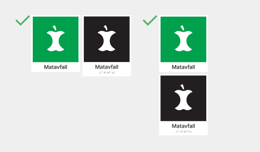
Special the Sorting Labels with Braille have been developed for people with visual impairments.
The Braille Sorting Labels:
- Used in black and white for maximum color contrast.
- Printed with tactile (raised) letters and icons.
- Used as a supplement to the regular color Sorting Labels. The Braille Sorting Label is placed to the right of or below the regular Sorting Label.
- Must follow the general rules for the use of the Sorting Labels.
Use of the Sorting Labels with braille (examples in Norwegian):
Use of the Sorting Labels is continuously expanding to more areas. If you have any suggestions or questions, please contact us at LOOP ([email protected]).